Tag: Elizabeth Cady Stanton

Deeds (and Words)

1972 electoral college map

As we lurch towards Thanksgiving, still dismayed at the outcome of the election and the steady appointment of very conservative white men as cabinet leaders, we are taking some time to look back and regroup before we move ahead. It’s difficult to find a silver lining in what feels like a crushing defeat, but we are hardly the first to walk this particular mile. Many of the women featured in Dead Feminists: Historic Heroines in Living Color suffered incredibly disappointing losses. As the first woman to run for President on a major-party ticket, Shirley Chisholm turned over her 152 delegates to George McGovern, who was crushed by Nixon (who resigned in 1974 to avoid impeachment). Elizabeth Cady Stanton and Susan B. Anthony spent their lives working for the cause of suffrage, but both died before women got the vote. Alice Paul penned the Equal Rights Amendment, but never saw it passed—nor have we. (In 1972, the ERA was finally passed by Congress and sent to the states for ratification. The original seven-year limit was extended by Congress to June 30, 1982, but at that deadline, the ERA had been ratified by only 35 states, three states short of the 38 required.) All these losses are a reminder that we have so much work to do, and it’s going to be a lot harder than we ever thought.

chandleroleary_jessicaspring_deadfeminists_book_signing_7331 chandleroleary_jessicaspring_deadfeminists_book_wordstock_8343 chandleroleary_jessicaspring_deadfeminists_book_wordstock_8358 chandleroleary_jessicaspring_deadfeminists_book_wordstock_8372

This fall, we have traveled around the Pacific Northwest sharing the stories of the women in our book. It has been largely celebratory—preaching to the choir, and meeting other authors with whom we agree. We spent several days in Portland for a long run of events, including the opportunity to speak on a panel at Wordstock about boundary-breaking women with best-selling author Laurie Notaro and moderator Elly Blue. An event at Powell’s on Hawthorne let us share the stage with Rad Women Kate Schatz and Miriam Klein Stahl. The tour wound up with an appearance at Beach Books on the Oregon Coast, attended by Jessica’s mom and three sisters—an intense feminist posse. We even hit the road on election day, speaking to a standing-room-only crowd at the University of Puget Sound, everyone jubilant with the thought that we’d be celebrating that night.

chandleroleary_jessicaspring_deadfeminists_book_signing_8403

A post-election event at Third Place Books last week was—in contrast—fairly somber, lightened by host Lish McBride (YA author of the fantastic Necromancer and Firebug series, who shared some tips for us newbie authors) and an earnest audience. Carole, an insatiable reader, asked us to sign a copy of our book to send to Donald Trump, thinking the abundant visuals would be welcome by a self-acknowledged non-reader. Another woman introduced herself as a Republican, sharing how she scolded her reading group, admonishing them that they could “still be Feminists and Republicans too.” We left that evening feeling recharged, having been told by many women there that they found some comfort in the gathering and were inspired by a message of action.

While it has been amazing to see our books in stores throughout the country, we are especially excited to have our work in Washington, DC. The National Museum of Women in the Arts will feature our broadsides through the inauguration, until March 17th. Knowing that others have tread this path before us, and still others are following behind us, both heartens and strengthens us. And more than ever, we are reminded that all of us have the right and responsibility to act, for our words and deeds have an impact on the future.

Dead Feminists broadsides and steamroller print by Chandler O'Leary and Jessica Spring, on display at the Chartreuse Gallery in Phoenix, AZ.

Save

Save

Save

Save

Tell tale feminists

Hand-lettered illustration from the book "Dead Feminists: Historical Heroines in Living Color" by Chandler O'Leary and Jessica Spring

Dead Feminists: Historic Heroines in Living Color has been out in the world for a few weeks, and most folks have been excited (beyond our immediate families). A common response has been one of surprise: “it’s a real book!” Dashing expectations of a coffee table book, Dead Feminists is more than 180 pages of the women, history and social issues entangled in our series of broadsides. Questions about the writing process have come up, from assumptions that we worked with a “real” writer, or that I did the writing while Chandler illustrated. While we definitely worked with talented editors at Sasquatch Books who steered the book towards “real” bookness, both of us did the research, writing and photo research over nearly two years.

womens_bible_wikicommons-768x999

Many of our dearest Dead Feminists are writers, artists, or both– evidence that we all find a way to tell our stories. Elizabeth Cady Stanton, who launched our series, wrote most of the speeches delivered by Susan B. Anthony. Some writers and their books are well known, like Gwendolyn Brooks and Rachel Carson—who both confronted ongoing challenging social and environmental issues—and their voices can guide us still. We have mere fragments of poetry from Sappho and carefully handwritten letters from Jane Mecom to her brother—they give us insights into their lives and eras when words from women weren’t often valued or recorded. In the chapter entitled Tell, we focused especially on women who had stories to share, like Virginia Woolf, who carefully crafted and composed both the pages and handset type for printing. Knowing the time and care involved, there is little doubt in my mind that the act of being writer and printer sharpens both crafts.

Historic image of woman printing, from the Library of Congress

Without the discovery of Rywka Lipszyc’s diary found in the ashes of a Auschwitz crematorium she would have disappeared from history. Sarojini Naidu dreamed of independence for India through her poetry (“Waken, O slumber Mother and be crowned”) and was revered as a nightingale, filling the night air with song. We hope you’ll explore these stories more in depth through the book—and for local folks we have some opportunities in the next few weeks to join us in person.

Dead Feminists event at Ada's Technical Books for Lit Crawl Seattle

Here’s what’s coming up this week and next, when you’ll find us invading first Seattle, then Portland. You can find future events and more info on our events page.

• • •

LIT CRAWL Seattle: book signing and artist talk
Thursday, October 27, 2016, 8 pm
Ada’s Technical Books and Cafe
425 15th Ave. E., Seattle, WA

• • •

BROADS AND BROADSIDES
A retrospective exhibition featuring our series through broadsides and steamroller prints
Reception, book signing & costume party
Come dressed as your favorite historical feminist!
Saturday, October 29, 4 to 7 pm
(the show continues through December 16)
School of Visual Concepts
2300 7th Ave., Seattle, WA

• • •

DEAD FEMINISTS and RAD WOMEN: joint author event
with Kate Schatz and Miriam Klein Stahl, authors of Rad Women Worldwide
Thursday, November 3, 2016, 7:30 pm
Powell’s Books on Hawthorne
3723 SE Hawthorne Blvd., Portland, OR

• • •

LIT CRAWL Portland: book signing and artist talk
Friday, November 4, 2016, 8 pm
The Big Legrowlski
812 NW Couch St., Portland, OR

• • •

WORDSTOCK: Portland’s Book Festival
Chandler & Jessica appearing on an author panel
with Danielle Dutton, author of Margaret the First
and Laurie Notaro, author of Crossing the Horizon
moderated by Elly Blue of Microcosm Press
Book signing to follow
Saturday, November 5, 2016, 1:30 pm
The Old Church
1422 SW 11th Avenue, Portland, OR

• • •

BEACH BROADS(ides)
book signing and artist talk on the gorgeous Oregon coast!
Saturday, November 5, 2016, 6:30 pm
Beach Books
616 Broadway, Seaside, OR

Save

Save

Save

Save

Save

Save

Save

Save

Save

Save

Save

Save

Save

Save

Rose City gals

Powell's City of Books photo by Chandler O'Leary

Seeing our stuff for sale at my all-time favorite bookstore makes me happier than I could ever see. If you’re in Portland, or you’re going to be, you can now find Dead Feminists postcards, lemonade journals and mini-prints at Powell’s City of Books! Last time I was there I found them in the Red Room.

Powell's City of Books photo by Chandler O'Leary

Rumor has it they’re also in the Orange Room, but Powell’s is crazy-huge and charmingly labyrinthine, so I never did come across them there. Never fear, though: the myriad Info Desk staff are smart and lovely. They’ll point you in the right direction.

"Dead Feminists" postcards by Chandler O'Leary and Jessica Spring

P.S. How cool is the description on that sign? I love these people.

Behind the scenes, part two

Metal type photo by Jessica Spring

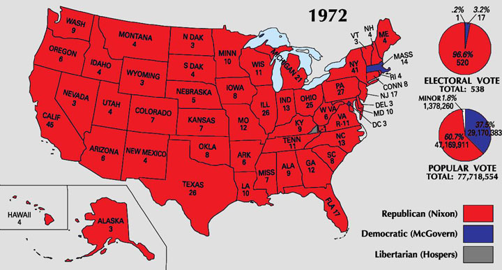
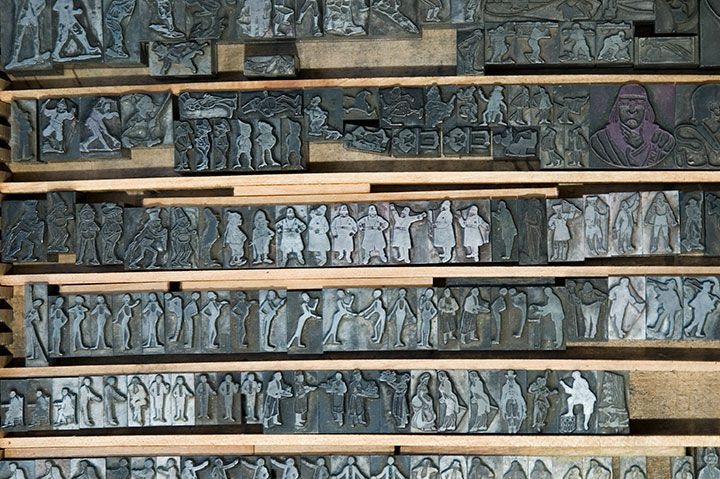
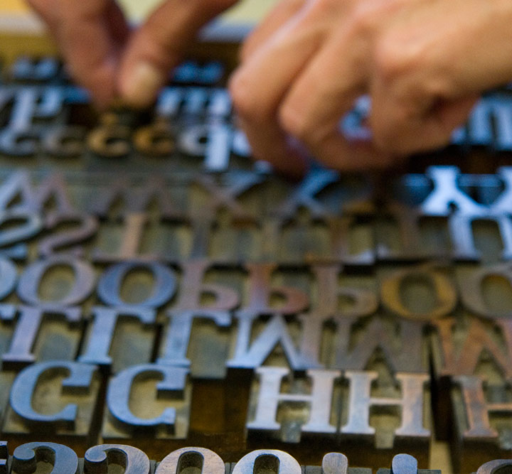
When it comes to letterpress printing, process is everything. And since that process is not always evident in the final product, I thought I’d share the technical aspects of the Dead Feminists series. Now, as I said in the last post, letterpress printing is traditionally done using metal or wooden type—or in the case of the photo above, relief images cut into type-high (.918 inches in the US and UK, in case you wondered) blocks. What Jessica and I have been doing, however, ain’t your grandpa’s letterpress. Thanks to a fairly new technology called photopolymer, we’re able to create our own relief plates right in the studio, without having to carve a block by hand or etch a plate with nasty chemicals. Photopolymer has also created a bridge between the traditional print shop and the modern digital world—as you’ll see in a moment. As far as the Dead Feminists go, Jessica and I still have both feet firmly planted in the traditional world—we just dip a toe into the digital realm now and again. Here, let me explain.

Process pencil drawings for "Come Come" and "Tugboat Thea" letterpress broadsides by Chandler O'Leary and Jessica Spring

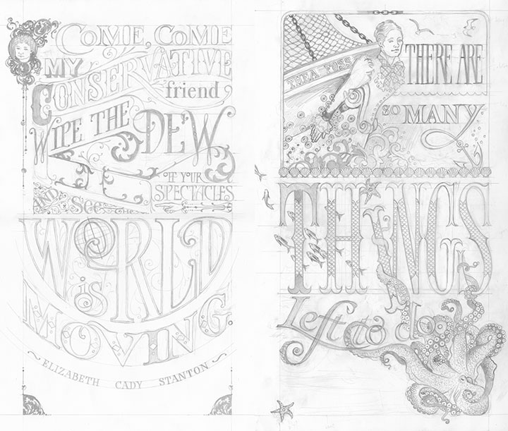
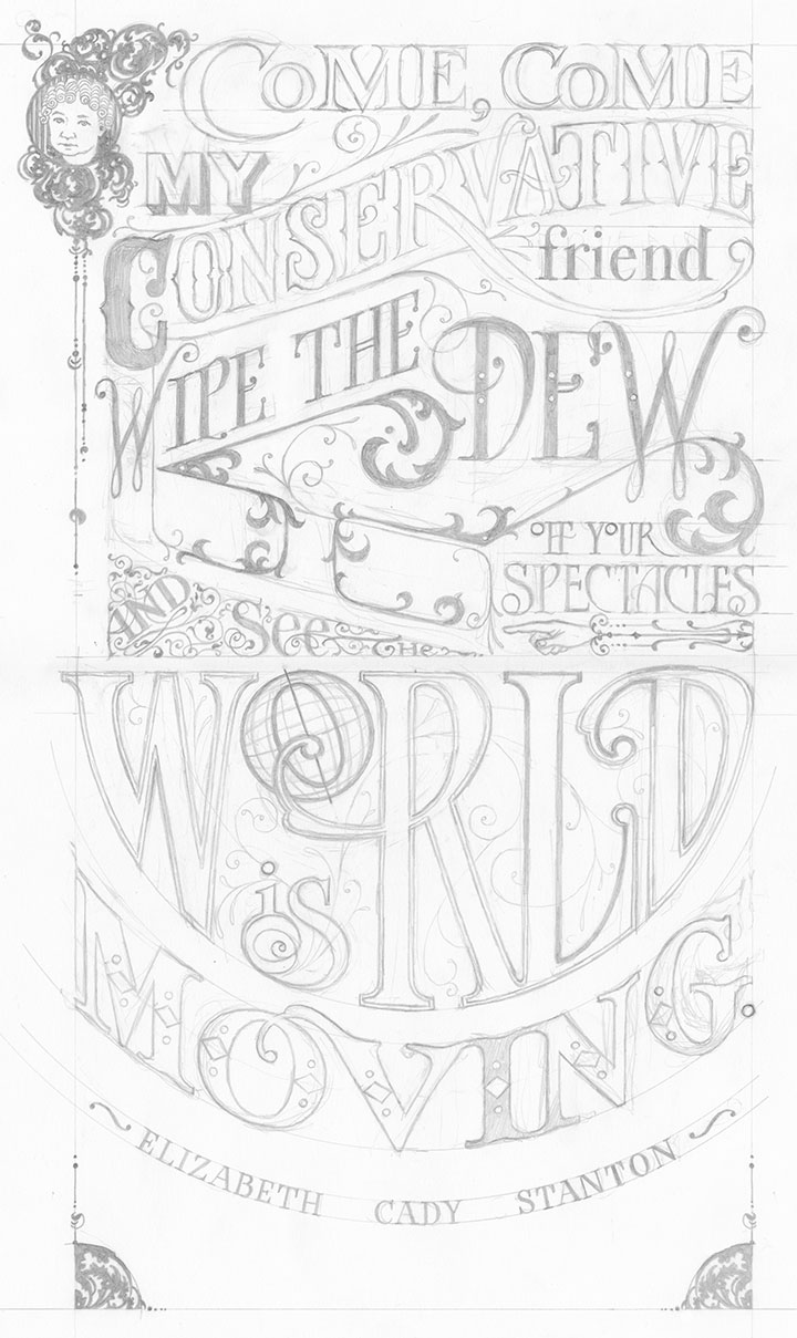
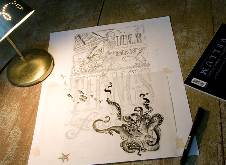
This is how it begins for each print: a pencil drawing, at full size. This is the stage where I not only design and illustrate the piece, but also start thinking about color choices: what the colors will be, what element will be which color, where the colors will overlap, how to make things work logistically. Now, this pencil layout isn’t enough to make a plate; for the photopolymer process to work properly, I have to translate the sketch into a solid black-and-white ink drawing.

Process drawings for "Victory Garden" letterpress broadside by Chandler O'Leary and Jessica Spring

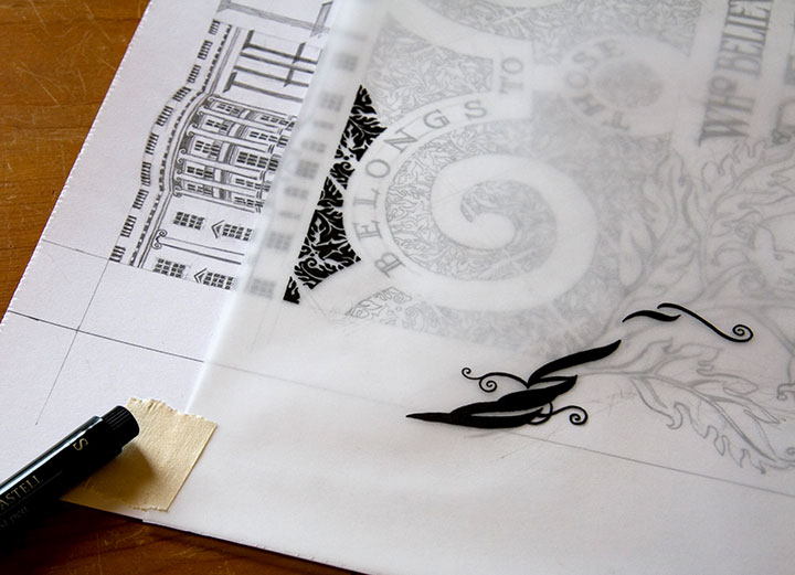
After everything is pencilled in, I lay a sheet of vellum over the drawing and trace everything in ink.

Color separations for "Victory Garden" letterpress broadside by Chandler O'Leary and Jessica Spring

Since each broadside is printed in two colors, each color means a separate run through the press. So as a result, I had to trace each color separately—being careful to stay as true as possible to the original drawing, since the colors had to line up exactly on press. If you were to line these two color separations up, on top of one another, you’d see how the colors will interact in the final piece.

Process drawings for "Tugboat Thea" letterpress broadside by Chandler O'Leary and Jessica Spring Process drawings for "Tugboat Thea" letterpress broadside by Chandler O'Leary and Jessica Spring

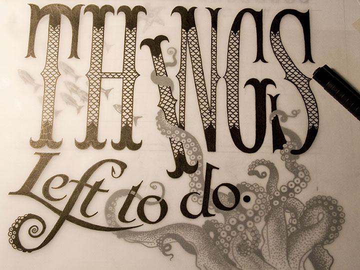
Here’s what I mean. You can see the separation that will become the grey color in Tugboat Thea here, laid directly over the inked octopus below. This is definitely the old-fashioned way of doing things; there are plenty of digital methods of color separation. I guess I just prefer the physical connection between the pen and the hand—even despite the greater risk of screw-ups (as you can see if you look closely at the word “to” above).

Detail of process drawing for "Tugboat Thea" letterpress broadside by Chandler O'Leary and Jessica Spring

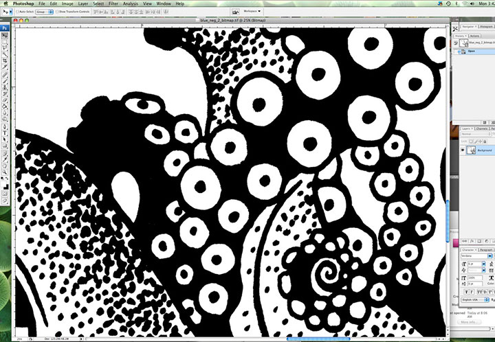
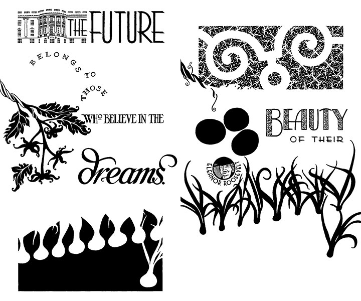
Here’s where I dip that toe into digital waters. Once I’m finished inking, I scan the finished line drawings at a super-high resolution and load them into Photoshop. This is where I clean up any mistakes (ahem) and convert the drawings into bitmap (pure black and white, with no grey) files. Jessica sends me her written colophon, and I set the text digitally. Then I export everything to the proper file type, and send the files to a local service bureau to have film negatives made. So now we’ve gone from analog to digital and back again.

Film negatives for "Tugboat Thea" letterpress broadside by Chandler O'Leary and Jessica Spring

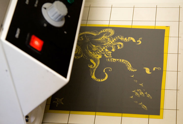
Here are the negatives for Tugboat Thea; grey separation on the top half of each one, teal on the bottom. As you can see, there aren’t any right angles in the bottom half (octopus) of the teal separation, so if you look closely you can see the little tick marks I added (above and to the right of the starfish) to aid with color registration. Those marks line up with a grid etched on the metal base we use to lock up the plates on press; once we had the plates exactly where we wanted them, I simply shaved those little tick marks off with an Xacto knife, so they’d no longer print. Real slick.

Photopolymer platemaking photo by Chandler O'Leary

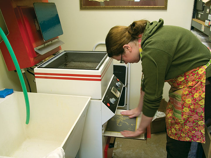
Anyway, photopolymer is a light-sensitive plastic that works just like making a contact exposure in a darkroom does. First I take a negative, place it face-down on an unexposed plate, and load both pieces onto the exposure tray of Jessica’s platemaker (which looks remarkably like an Easy-Bake Oven).

Photopolymer platemaking photo by Chandler O'Leary

The negative is held flush with the plate by a layer of plastic and a vacuum system; the plate is exposed with UV light (some DIY enthusiasts also accomplish this using glass and a bright, sunny day, but photopolymer is awfully expensive to use in sketchy experiments in the cloudy Northwest).

Photopolymer platemaking photo by Chandler O'Leary

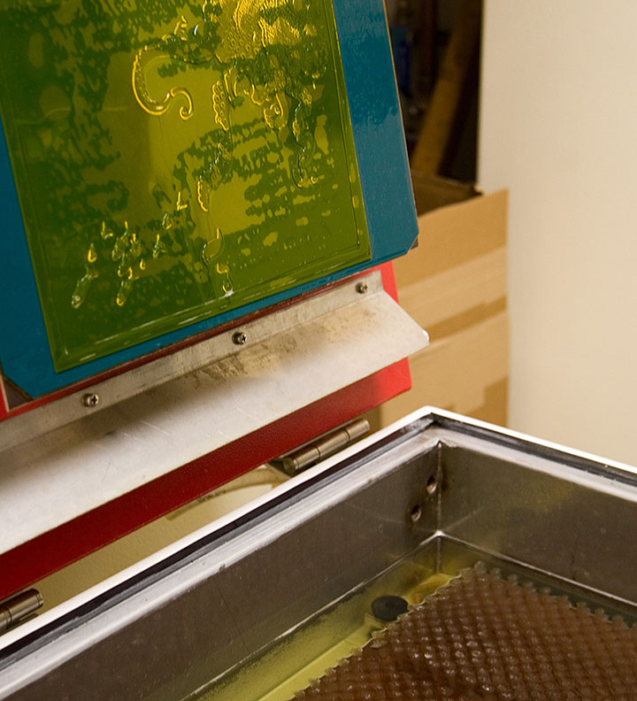
Next I place the exposed plate in the wash-out unit, where it is scrubbed gently with soft bristle brushes in a tank of cool water. Everything that is exposed is hardened enough to resist scrubbing, while everything else dissolves away. (And turns the water a sickly shade of yellow. Mmmm….plastic byproducts. Still, it’s less toxic than many other printmaking techniques.)

Photopolymer platemaking photo by Chandler O'Leary

What we’re left with is a raised plate ideal for relief printing. The real benefit of photopolymer is that it can reproduce nearly any image, and can hold an incredible amount of detail. I can transfer my drawings directly to the plate, without adding the laborious step of carving the image into wood or linoleum (backwards!), or etching copper with acid, for example. It’s not exactly an economical option for letterpress printing, but the results can be exquisite, and the possibilities are nearly endless.

Process photo of "Tugboat Thea" letterpress broadside by Chandler O'Leary and Jessica Spring

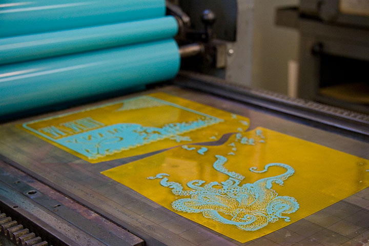
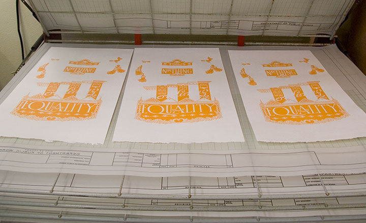
Here’s our new octopus plate on press, all inked up and ready to print—it’s stuck to that gridded base with removable adhesive. The thickness of the plate and base together add up to exactly .918 inches. Ah, precision feels good.

Printing process photo of "Tugboat Thea" letterpress broadside by Chandler O'Leary and Jessica Spring

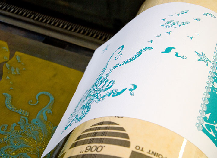
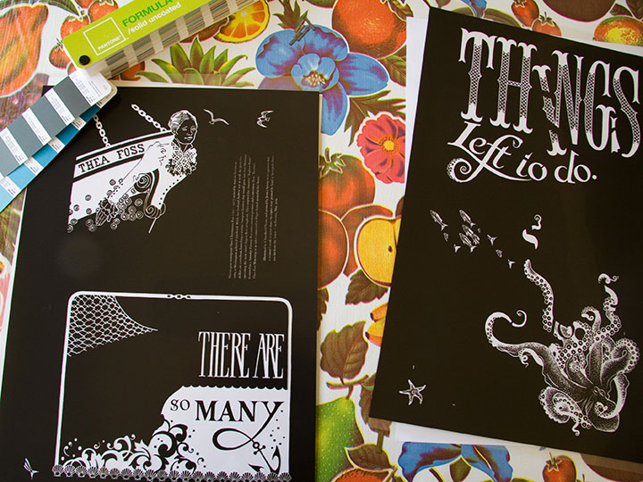
And here’s how it looks on paper.

Printing process photo of "Tugboat Thea" letterpress broadside by Chandler O'Leary and Jessica Spring

Here you can see the registration between the colors. This is the hard part—I’m sure that despite my best separation efforts and useful tick marks, Jessica is ready to tear her hair out whenever she sees what insane registration issues I’ve thrown at her this time. She’s not a master printer for nothing, though—tiny, 9-point colophon type? Large, solid color blocks? Exacting registration with no margin of error? She can handle anything.

Jessica Spring mixing ink at Springtide Press; photo by Chandler O'Leary

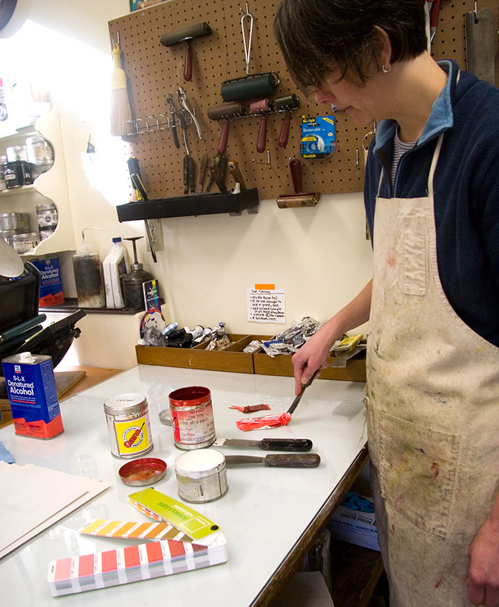
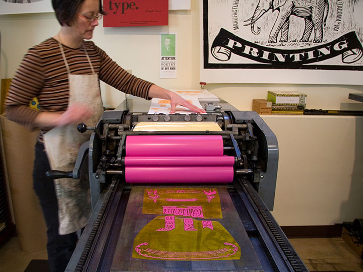
Actually printing these broadsides is where all our careful planning and preparation goes right out the window. We can sketch and plot as much as we like, but many of our artistic decisions end up being made on the fly, right on press. Here Jessica is mixing ink for Prop Cake, according to some choices I suggested in our handy-dandy color recipe book.

Jessica Spring mixing ink at Springtide Press; photo by Chandler O'Leary

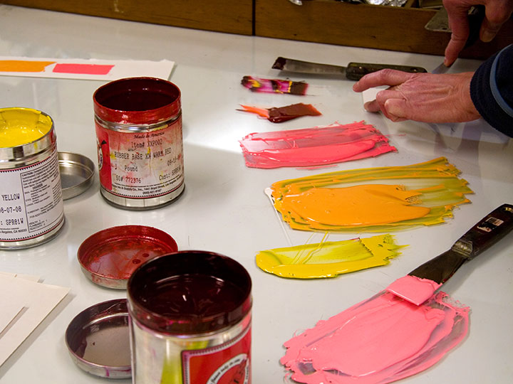
You can see our original draw-down (color test) in the upper left corner. So far, so good.

Process photo of "Prop Cake" letterpress broadside by Chandler O'Leary and Jessica Spring

The orange turned out exactly as we’d hoped, but when we started printing the pink separation, we hated the result. What looked so good in the draw-down lost all its contrast in the print. It was awful, trust me.

Process photo of "Prop Cake" letterpress broadside by Chandler O'Leary and Jessica Spring

So Jessica changed the color right on press, until we were happy with it.

Process photo of "Prop Cake" letterpress broadside by Chandler O'Leary and Jessica Spring

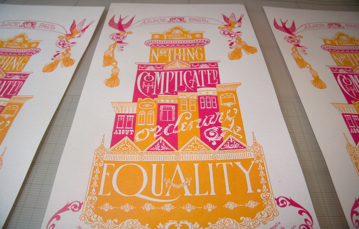
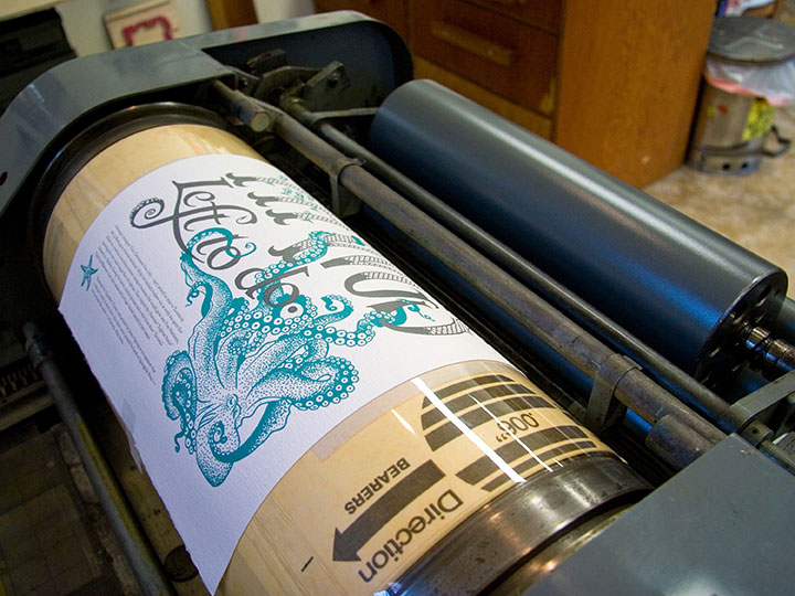
Here’s the finished product, all lined up in the drying rack.

If lining up the color areas is the hardest part of printing, keeping an eye on the ink consistency was probably the most fiddly. We’re using a very unusual paper for these prints—one made from recycled clothing—that is extremely “thirsty.” Not only are there inconsistencies in the paper that can throw off the overall quality of color; but we had to add ink to the press after every fourth or fifth print. As you can see, this is a pretty organic process—lots of variables, small corrections and compromises along the way. (And a whole lot of cursing and starting over.)

All of this is par for the course for a letterpress project—it’s an exacting, sometimes frustrating process, but that’s what we love about it. And the finished product … well, it’s like nothing else. Ah, letterpress, how we love thee.


Behind the scenes, part one

Detail of "Tugboat Thea" letterpress broadside by Chandler O'Leary and Jessica Spring

Holy cannoli, everyone! I’ve only just now come up for air—I’ve been buried under invoices, subscription forms, kraft mailers, and email print-outs, and Thea’s face is repeated all around me as reserved copies are spread all over the studio. Since I posted her here on Tuesday night the orders have just poured in, and over three-quarters of the edition is spoken for already. And Prop Cake is disappearing fast, too; we’re down to our last handful. Wow—just…wow. Thank you all so, so much.

Since Jessica and I talked about our process at the Tacoma Art Museum the other day, we thought it made sense to share that process with you, as well. But since there’s rather a lot to say on the subject, I’ve decided to break it into two posts.

• • • • • • • • • • • • • • • • • • • • • • • • • • • • • • • • • • • • • • • • • • • • • • • • • • • • • • • •

Before I get into the technical details behind our series, I should probably share a little background information on letterpress and the art of the broadside. For those of you who aren’t familiar with the process, letterpress printing refers to a type of relief printing, where pressure is applied to a piece of paper placed over a raised form that is covered with a thin layer of ink. This pressure transfers the inked image onto the paper, and can be repeated to create a batch, or edition, of prints. The form can be a carved block of wood or linoleum; a raised plate made of magnesium, photopolymer (plastic) or other materials; or as the term letterpress implies, movable type made from metal or wood.

chandler_oleary_studio_2652

The innovation of printing words from individual letter blocks that can be rearranged and reused was actually invented by the ancient Chinese (seriously, what wasn’t originally invented in China? We owe those folks a whole heap), but the process that evolved into modern letterpress was most famously perfected over 500 years ago by Johann Gutenberg, of Gutenberg Bible fame. By the first half of the twentieth century, when more modern commercial printing came along, it was still common for printers to perfect their layouts using movable type and relief-cut images on a proof press (such as Jessica’s Vandercook below). They’d then use the resulting print to make more sophisticated plates for their more efficient and advanced commercial presses.

Process photo of "Prop Cake" letterpress broadside by Chandler O'Leary and Jessica Spring

As commercial printing became more streamlined, the cylinder and platen proof presses (see photo of Jessica printing above) fell out of vogue, and eventually were no longer manufactured. Artists quickly saw their potential, however, and have adopted letterpress printing as an art form—using, refurbishing and maintaining this antique equipment to create original works of art.

Vintage broadsides

Hand-in-hand with letterpress printing, the art of the broadside has also survived and evolved into a modern format. The term broadside means any single sheet used to convey information, often of a political kind—the great-grandpappy of the modern poster. While today the words broadside and poster are sometimes used interchangeably, the broadside has remained a favorite of the letterpress community because of its emphasis on typography and content (hey, we need an excuse to use all that gorgeous metal type!).

Dead Feminist broadsides by Chandler O'Leary and Jessica Spring

Jessica and I had this history in mind when we began the Dead Feminists series. As I said before, we never dreamed of starting down the path we’re on now; we just wanted to make a political and artistic contribution to the election. And to pay homage to the history of the broadside and the era in which each of our feminists lived, I designed each piece with historic broadsides and posters in mind. And to keep the series consistent, Jessica and I came up with a few rules of engagement:

1. Each poster has to feature a quote by a feminist. It doesn’t necessarily have to be a woman, but there are already plenty of posters highlighting the words of dudes, so we figured that one was covered already.

2. Said feminist must be deceased. (Hence the name.) You’d be surprised how many challenges that’s created for us.

3. Each quote is tied into a current sociopolitical issue or event. This is usually Jessica’s job, as she’s got a particular knack for finding relevant quotes.

4. The whole piece (except the colophon at the bottom, of course) is hand-drawn.

5. We try to stay away from well-worn tropes like “women can do anything men can do!” in favor of broader topics and concepts.

Who knows how long people will be interested in these things, or how many broadsides there’ll be in the series—all we can say is that we’re grateful for the response people have had, and we’re having way too much fun to quit now. The fun of art-making and the joy of the public response aside, the best part of creating this series has been exploring the lives and work of so many inspirational people. “Feminism” has become somewhat of a dirty word these days—mostly because of misconceptions. To us it’s a positive thing, and creating this series is our way of celebrating those who championed far more than just gender equality. Besides, we’d like to make our own contribution to our social history—and using the “power of the press” in the literal sense is the best way we know how.

• • • • • • • • • • • • • • • • • • • • • • • • • • • • • • • • • • • • • • • • • • • • • • • • • • • • • • • •

Coming in part two: the nitty gritty details behind our process.


Come, Come

"Come, Come," letterpress broadside by Chandler O'Leary and Jessica Spring

We should probably start this blog with where this whole thing began. You see, we never meant the Dead Feminists to be a series at all. Just as the 2008 Presidential election was heating up, Jessica asked me if I wanted to collaborate on a political broadside together. We both felt like it was an important moment in history, and we wanted to make some sort of contribution to the artistic record. Jessica said she had a historical quote that would be fun to typeset, and asked if I could do a quick illustration of a pair of spectacles to go with it. She thought it’d be fun to make the glasses look like the famous eyewear of a certain Alaskan VP candidate (who can see Russia from her house!)—her plan was to use her impressive collection of wood and metal type to hand-set the quote into the design.

Well, she probably shouldn’t have left me alone with my pencils, because I got a little carried away, and drew not just the glasses, but the whole quote around them, too:

Come, come my conservative friend, wipe the dew off your spectacles and see the world is moving.  — Elizabeth Cady Stanton

I did this because I wanted the piece to be something more than simply a jab at a political personality. I wanted it to be beautiful in its own right, something that might do justice to Stanton’s words, and that would be longer-lasting than a momentary visual pun. Besides, Stanton put up one of the most important fights in American history: women’s suffrage. In this country with with a voter turnout rate of less than two-thirds, I wanted to do my small part to get women everywhere, regardless of political stripe, to the polls. And then, as it always does, my fingers started itching to draw my own letterforms. After all, for as much as I love hand-setting type, one of the reasons I’m a letterer is because I’m continually frustrated by the finite number of typefaces available in wood and metal. Not that I’m happy with choosing among the thousands and thousands of digital font families out there, either. Let’s just say I’m picky. So I made up my mind to letter the whole thing by hand, and not to tell Jessica until the sketch was done.

Hand-lettered process drawing for "Come, Come," letterpress broadside by Chandler O'Leary and Jessica Spring

Bless her heart, she went along with the idea. We scrapped the idea of setting vintage type and printed the image using a modern material called photopolymer plates (more on that on our process page). And then we put the broadside into our online shop, and sent out an email to our little mailing list to let them know we’d made something new.

Three days later, the entire edition of prints was sold out. We were floored! Neither of us had ever experienced this kind of clamoring for our work before—we’d both sold out editions before, but not this quickly. People started emailing us and asking if we were going to do more posters. After reading that, we kind of looked at each other and said, “Why not?”

And all of a sudden, we had ourselves a series.

• • • • • • • • • • • • • • • • • • • • • • • • • • • • • • • • • • • • • • • • • • • • • • • • • • • • • • • •

Come, Come: No. 1 in the Dead Feminists series
Edition size: 44 prints
Poster size: 10 x 18 inches

Printed on an antique Vandercook Universal One press, on archival, 100% rag (cotton) paper. Each piece is numbered and signed by both artists.

Colophon reads:
Elizabeth Cady Stanton (1815 – 1902) spent her life in pursuit of women’s rights. She wrote many speeches delivered by Susan B. Anthony, who said Stanton “forged the thunderbolts” that she delivered as they worked together for women’s suffrage. Stanton raised seven children and organized the first women’s rights convention in Seneca Falls, NY in 1848 but died without ever casting her vote before the 19th Amendment passed in 1920.

Poster is sold out. Reproduction postcards available in the shop!