Month: September 2016

Calls to action

Hand-lettered illustration from the book "Dead Feminists: Historical Heroines in Living Color" by Chandler O'Leary and Jessica Spring

One of the biggest challenges of turning the Dead Feminists into a book was figuring out a way to tie all our broadsides together in a way that was engaging for the reader. Aside from the size and format of each broadside, our prints had little in common with one another. Our feminists were a diverse group without much of an underlying thread—even the style of illustration was different for each one.

Hand-lettered illustration from the book "Dead Feminists: Historical Heroines in Living Color" by Chandler O'Leary and Jessica Spring

Jessica came up with the solution: using action verbs to tell our story. After all, our aim with the series was to use the literal and figurative power of the press to change the world around us. The women we featured had also created change—they were active, not passive. So we divided our 24 feminists among eight action words, choosing for each chapter a trio of women who shared qualities or deeds with that particular verb. And since we’re so close to the release of the book (just two weeks!), we thought we’d share a few of those words with you.

Hand-lettered illustration from the book "Dead Feminists: Historical Heroines in Living Color" by Chandler O'Leary and Jessica Spring

The best part for me, of course, was being able to make more hand-lettered illustrations! Each chapter’s verb is done in a different style, and elements of that illustration are carried throughout the rest of the chapter.

Hand-lettered illustration from the book "Dead Feminists: Historical Heroines in Living Color" by Chandler O'Leary and Jessica Spring

Of course, shoe-horning each feminist into one of the eight action themes was sometimes a convoluted business, but we got there in the end. We’re super pleased with how it all turned out—and hopeful that it might inspire more women and girls to take the lead with some action of their own.

Save

Save

Save

Save

Save

T-minus…

Book process photos for "Dead Feminists: Historic Heroines in Living Color" by Chandler O'Leary and Jessica Spring

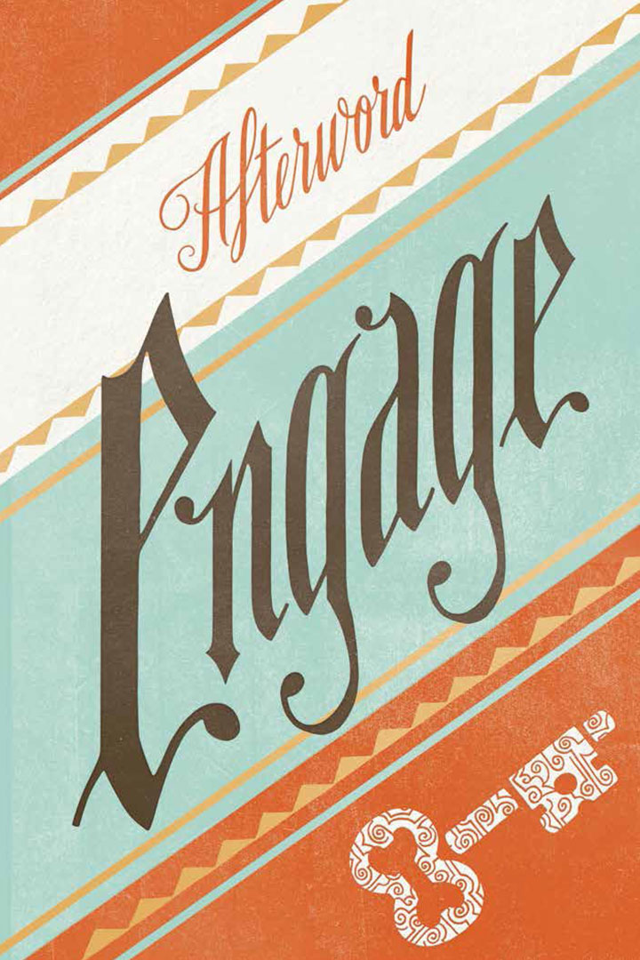
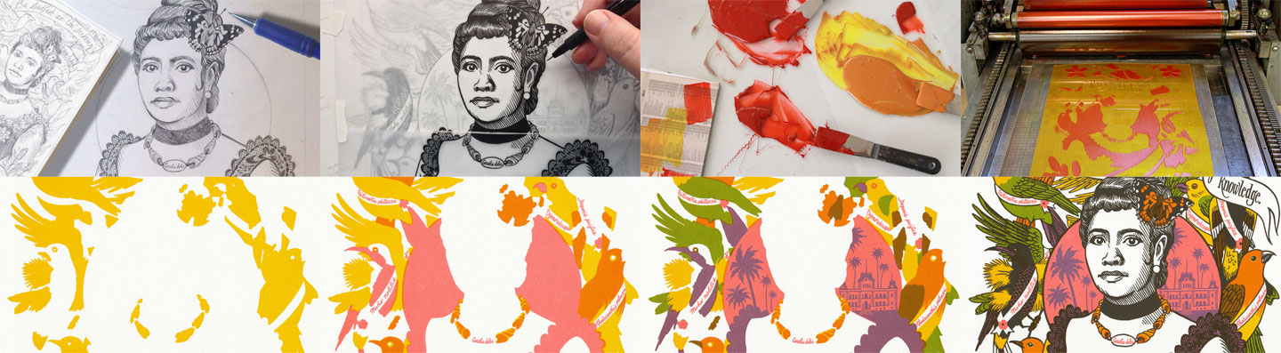
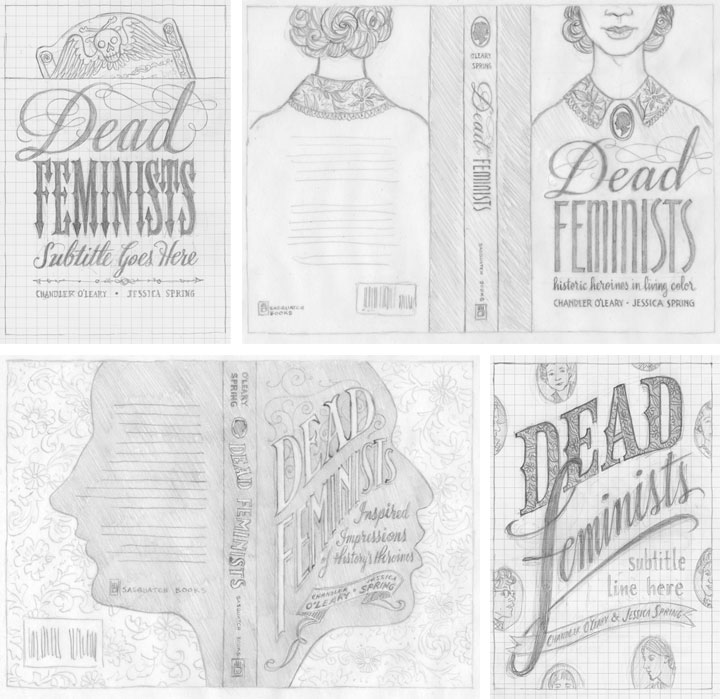
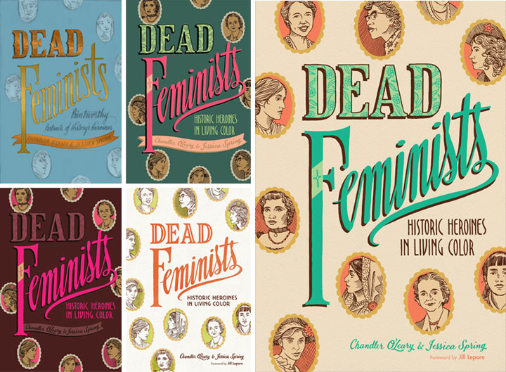
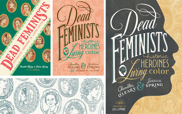
Jessica and I were so immersed in the process behind our book for so long that it still feels weird that the final product is almost here. Yet here we are, just under a month away from our release date! We have a metric ton of events planned in the next few months, with more being added all the time. And since releasing a book is a bit different than releasing a broadside, we’re already getting lots of questions about how this is all going to work. Here are the ones we’re hearing the most so far:

Where should I buy my copy? Should I wait until the release date?

You can preorder the book now from your favorite bookseller. Large or small, brick-and-mortar or virtual, indie or corporate, they can all get our book into your hands, and we have links to the book on both large and indie retailers over on our book page. Here’s the thing, though: preordering your copy really does help. Preorders can help retailers foresee how popular a book is going to be—the more preorders there are, the more they’ll stock when the book comes out. And more stock raises the book’s ranking, making the title more visible and searchable on retailer websites. It helps spread the word for us and introduces our book to a wider audience. So if you’re so inclined, preordering now will help ensure we get a good head start.

Would you rather I buy it from you and Jessica directly?

Thank you for thinking of us, and wanting to support us directly! In the end, though, we’ve decided that we will only be selling the book ourselves at certain local, in-person events. Events where we will sell the book ourselves include:

Tacoma Studio Tours, October 15-16
• Our exhibit opening at Seattle’s School of Visual Concepts, October 29
• Our Portland Lit Crawl event, November 3
• Our artist talk at the University of Puget Sound Library, November 8
• Our library talks in University Place (December 14) and Lacey (December 15)
• And by request/appointment for Seattle/Tacoma-area folks (you can always contact us if you want to do this)

If you want your copy shipped somewhere, your best bet is to order from your favorite bookseller. And since many of our other events are being hosted by bookstores and galleries, those folks will handle sales at those events. Here’s where you can find an up-to-date list of all our events so far.

What if I want a signed copy? If I’m not local, can I still get one?

Absolutely! Our local bookstore, King’s Books, is offering signed copies, which you can preorder on their website. They can ship anywhere in the world—all you need to do is specify that you want a signed copy in the “order comments” box when you place your order. Also, please specify if you want your book simply signed, or if you want it personalized to a specific name.

I am local, and I want to celebrate! Are you having a book release party?

You betcha! We’re having our official release party at King’s Books in Tacoma, on Tuesday, October 11 at 7 pm. And it’s a costume party! Come dressed as your favorite dead feminist and celebrate with us.

I’m a retailer, and I want to carry your book in my store. Do I purchase copies from you?

Retailers can buy wholesale copies direct from Penguin Random House, who is distributing the book. You’ll need to set up a retail account with them first, but from there bulk orders are easy. To get started, call 800.733.3000 or email csorders [AT] penguinrandomhouse [DOT] com.

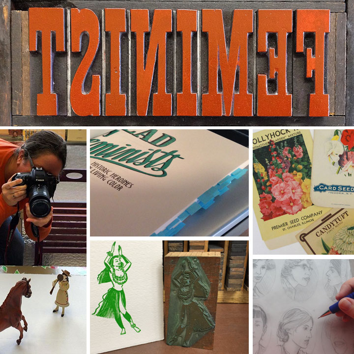
Since the book is coming out, does that mean the letterpress broadside series is ending?

Not at all. Actually, our 24th and newest broadside will appear both in person and in the book concurrently. So that means we’re keeping it under wraps until the book comes out, but we’ll have some sneak peeks to show you in the next few weeks. And if you’re local, you’ll be able to see the print in person at Studio Tour on October 15-16, or at our upcoming exhibits in Seattle and Portland.

826chi

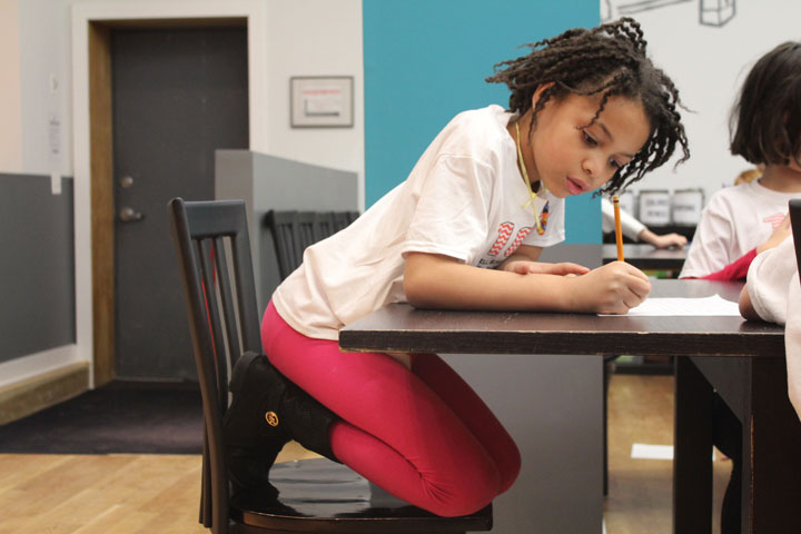
A young writer at one of 826CHI, a writing center we supported with our Warning Signs broadside. Photo courtesy of 826CHI.

And that brings us to some other great news we wanted to share with you. As you might already know, previously when we have released letterpress broadsides, we have also made donations to nonprofits that align with the issues we highlight with each print. With the book and broadside #24 about to come out, we’re starting a new chapter by inaugurating the Dead Feminists Fund.

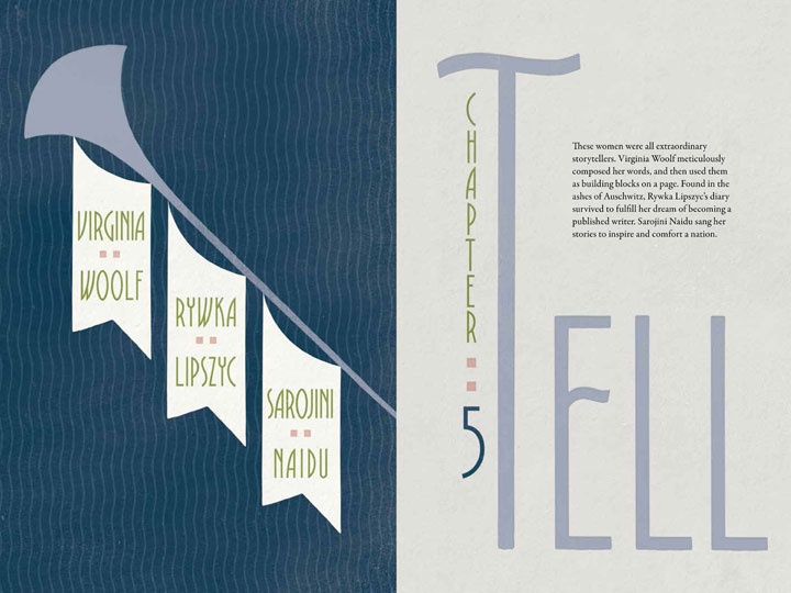
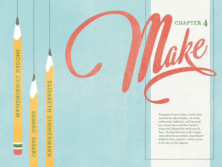
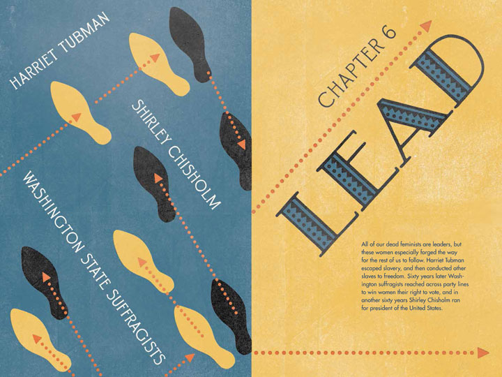
In honor of the power of women’s work, the Dead Feminists Fund supports nonprofits that empower girls and women to create change in their own communities. Like our book, funding is organized under a series of Action Verbs (“Make,” “Grow,” “Lead,” “Tell,” etc.), which translate to micro grant categories. Each year the Fund will support nonprofits with micro grants in one of our Action categories.

The Dead Feminists Fund is a component fund of the Greater Tacoma Community Foundation, which manages, administers and invests in over 400 charitable funds, right from our home community of Tacoma. Being under the auspices of the GTCF allows donations made directly to the Dead Feminists Fund to be tax-deductible, and provides the proper legal framework to protect both our donors and our grant recipients.

iprc

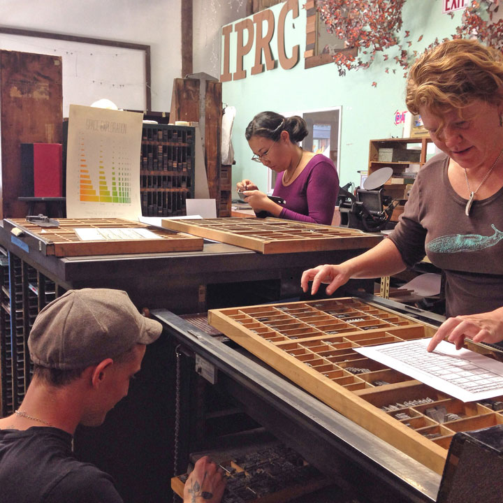
Artists typesetting at the Independent Publishing Resource Center, an organization we supported with our Paper Chase broadside. Photo by Caitlin Harris.

We seeded the Dead Feminists Fund with a large percentage of our book advance, and we will continue to donate a portion of our future broadside proceeds to supporting the Fund. Best of all, thanks to the generosity of Sasquatch Books, a portion of the sales of our book will also be contributed to the Fund. We’re especially grateful to Sasquatch because as an indie regional publisher, they understand the importance of giving back to one’s community, and how small gifts can make a big impact. And Sasquatch also knows the importance of supporting women and girls—after all, the team of editors, designers and marketing folks who have worked with us on our book with us are all women. If that’s not girl power, we don’t know what is.

If you’d like to support the Fund directly, you can make a tax-deductible donation directly through the Greater Tacoma Community Foundation website. (At that link, scroll down to find the Dead Feminists Fund in the alphabetical list.)

As always, thank you so much for your support of our series over the last eight years—we can’t wait to share the next chapter with you.

Save

Save

Save

Save

Save

Save

Save

Save

Save

Save

Save

Save

Save

Save

Cover to cover (to cover)

Book cover process sketches for "Dead Feminists: Historic Heroines in Living Color" by Chandler O'Leary and Jessica Spring

It’s hard to believe we’re only five weeks out from the release of our book! A few advance reader copies are making their way around to media outlets already, and several people have asked us how we came up with the cover design. Since getting to the finished cover was quite a process, we thought we’d show you a bit of the winding path that got us here.

When Sasquatch Books first signed us as authors, they offered us the chance to design, illustrate and hand-letter the cover. Needless to say we jumped at it. But designing a book cover can be very different than designing other things—the stakes are higher, for one thing. In some ways, it’s more of a science than an art: a good cover can have a lot of sway in terms of book sales, so it has to be as eye-catching, informative and readable as possible. So to make sure we got it right, it was a hugely collaborative process—not just between Jessica and me, but also with the publisher, the art director, our editors, the sales team, and lots of other people we never even met in person.

Jessica and I started brainstorming and sketching cover ideas way back in November of last year; above are a few of the concepts we sent along. We had a lot of feedback that large, legible type was key, so that was a good starting point. We also had to be really careful about the hierarchy of type. We had to make sure “Feminists” caught the eye first, followed by “Dead,” then the subhead, then the byline, etc. Later, when we got the happy news that Jill Lepore would be writing the foreword to our book, that added another level to our type hierarchy. In addition to all of this, we wanted to give the Sasquatch team plenty of options, so we tried to make each concept distinct from the others. Right away the clear favorite was the one in the lower right corner, so that was the concept we took to the next level.

Book cover process sketches for "Dead Feminists: Historic Heroines in Living Color" by Chandler O'Leary and Jessica Spring

Then came a long parade of versions in color. We worked closely with Sasquatch’s art director and lead designer, Anna Goldstein, to try to catch that elusive unicorn that is a cover that works. I’d mock something up and send it to Anna; she’d mock something else up and send it back to us; rinse and repeat. Each time it felt like we were getting closer, but every time it felt like something subtle was missing. So we made a million little tweaks, to color, to lettering, to texture, to contrast, to composition, to kerning, etc. Each time one of us would have what seemed like a great idea, and each time the result was lacking somehow. I don’t even remember how long we stayed in this holding pattern. (Normally I keep all the iterations of a design carefully numbered in chronological order, but at some point I just lost track. I gave up and labeled that file “VERSION WHATEVER.” It makes me laugh every time I see it.) Everybody was frustrated: the elusive unicorn had transformed into the Holy Grail.

And then I think we all finally conceded that small tweaks were never going to get us there. We needed something to change in a big way, and we needed to scrap much of the work we’d done thus far. This is a really hard thing to admit to oneself—that maybe one’s brilliant idea wasn’t so brilliant after all. But the finished product is more important than anybody’s ego, and no matter how good a kernal of an idea might be, it’s not worth bringing down the whole design over it.

Book cover and process sketches for "Dead Feminists: Historic Heroines in Living Color" by Chandler O'Leary and Jessica Spring

So we quite literally went back to the drawing board. I knocked together a few more pencil sketches, and we asked the whole team again what elements they thought were essential. A lot of people responded to the little cameo portraits of the various historical figures, so we came up with the idea to use them as more of an overall pattern (that’s the green cover on the left, above). Then our editors gave us the feedback that maybe the cover should be more like the style of our broadsides, with bold lettering in many different styles. Anna added the suggestion of making those cameo portraits more of a faint pattern than a major focal point, and then the lightbulb seemed to go on at last. That peach version in the center, I think, was what I put together next. Jessica and I could see that the most recent advice was on the right track, but we were still worried it wouldn’t stand out when seen on a display shelf with a hundred other books. Our editor asked us if we had any ideas for how to make it pop, and in wild desperation I fished out one of our earliest pencil sketches (above), the one with the face in silhouette, and gave it another look. What didn’t seem to work in sketch form suddenly felt like the missing ingredient when paired with the cameo pattern and the bold lettering. We sent a version back to Anna, and she gave it that antique texture and the gold-grey-and-teal color scheme you see here. And that was it—it was like she’d flipped a switch, and voilà: finished cover.

Over the course of eight years of printing our broadsides, Jessica and I had grown accustomed to just doing whatever we want in terms of design and content. With small editions to print, and nobody to please but ourselves, the stakes were low—and there was always plenty of room for experimentation. This book has been an entirely different animal, and I think designing the cover has been a perfect metaphor for the whole process. Writing a 40,000-word manuscript about history and feminism was never something we thought we could do, but with the incredible help of our editors, we got there. Likewise, designing the container for that content was a massive group effort—so major props and big thanks to Anna for sticking with us. Getting to the finish line required stepping way beyond our comfort zone—and more importantly, it took the whole team. We couldn’t have done it alone, and that’s a good thing, because both book and cover are the better for it.

Save

Save

Save