At long last, Jessica and I are ready to unveil our newest broadside—a piece that has been weighing heavily on our hearts and minds. Our journey began in April, when over 200 girls were kidnapped from their school in Chibok, Nigeria. Since then the media has been filled with accusations leveled at Islam—a culture we know to have a long history of valuing education, innovation and knowledge. We also know that the danger of extremism knows no cultural boundary—and that it would benefit us all to build a world where every girl has the opportunity and security to obtain an education.
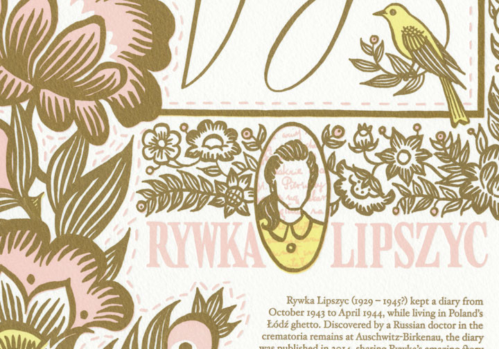
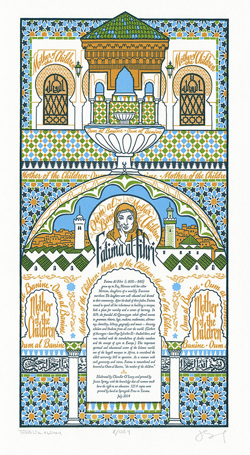
So after months of exhaustive research, we decided to go back in time to some of the earliest days of higher education, and to the life and work of Fatima al-Fihri—the woman who founded Al-Qarawiyyin, the oldest university still in operation today. Because Fatima lived in the 9th century, no direct quotes have made it to the present era. Instead, the piece highlights Fatima’s honorific title: Oum al Banine, or “Mother of the Children.”
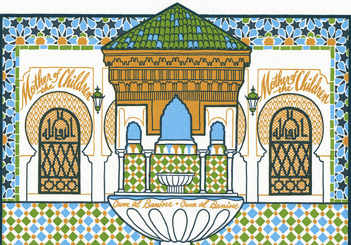
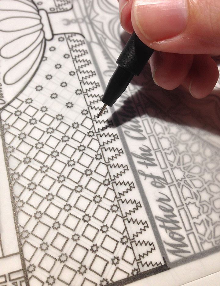
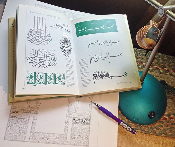
The phrase weaves through the piece like the mortar between stones, repeating again and again like a mantra. The design mirrors the Arabesque decorative style, as well as the common practice of decorating Muslim houses of worship with text (often phrases from the Qur’an). Because it is forbidden to depict the Prophet in Islam, architecture is usually adorned with text and geometric patterns instead.
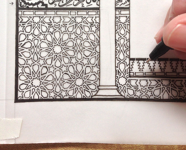
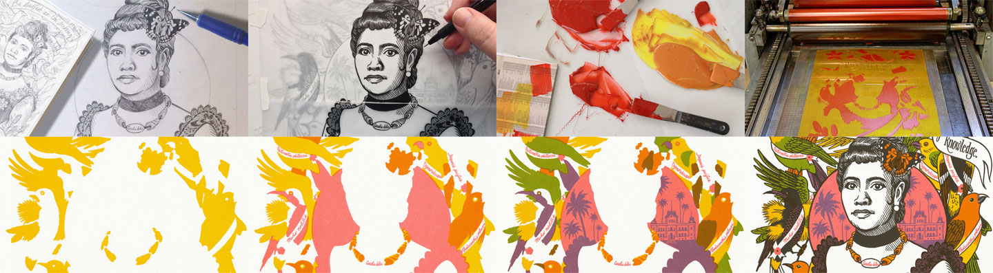
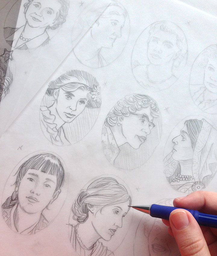
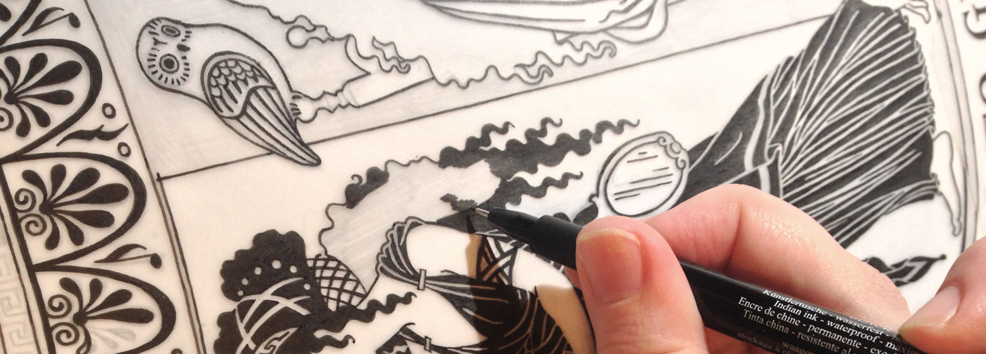
I spent a long, long time creating this illustration—not only because of all the ornate patterning, or the carefully-researched Arabic script. Not just the time I spent trying to find images of Al-Qarawiyyin, or information about Fatima’s life. Somehow, the act of creating this illustration became something of a mantra in itself. All the time required to draft these patterns and compose the page became a form of meditation—and I needed that with this piece. Because much more than that, this became an exercise in trying to understand.
I was trying to understand why we had so much trouble finding a voice for this piece. Why we had to go back 1200 years to find a woman like Fatima, who had made a lasting contribution and who was remembered. Why we could not find a relevant, direct quote at all, despite months of research and consulting scholars on this topic. Why it is so difficult and dangerous for a girl to obtain an education in so many parts of the world. Why there is so much violence and hatred and fear surrounding a belief system with so much beauty inherent within it. Why we are still asking these basic questions after so many centuries have passed.
The answers did not come with the completion of the drawing. They did not come off the press with the finished prints. They will not come through my fingers as I type this. If they cannot come as a result of war, or negotiation between heads of state, or elected office, or royal birthright, or the swell of the mob—they won’t come from me.
But I do know this: every human life is worth the same, and deserves the same chance in life. And more than anything else, I know that education, even at its most basic, is the best chance anyone can have to make a good life—for themselves, and for the rest of us. Education is the best defence we know against extremism, poverty, and violence. So this is where we begin. Where we should always begin.
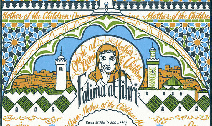
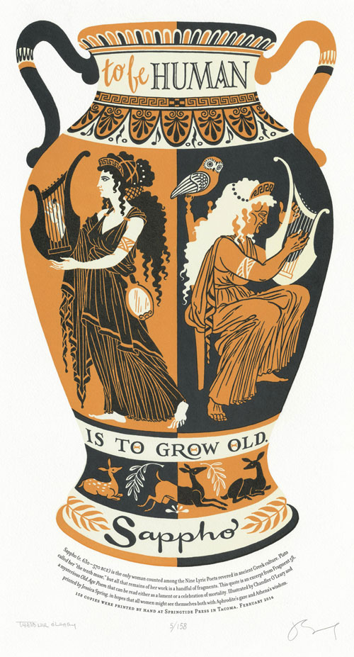
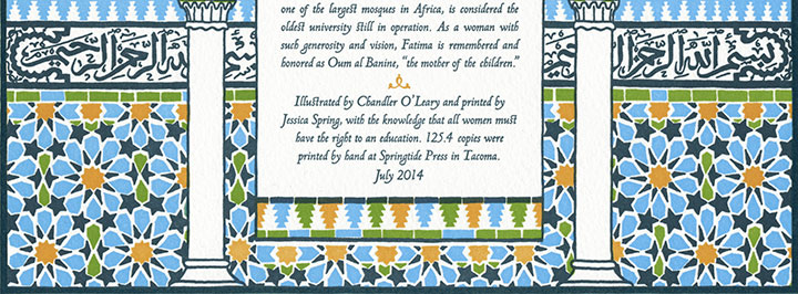
Our 20th Dead Feminist broadside is an ornate tribute to Fatima’s world and the institution she founded. The composition, structured like a Persian manuscript page, features an illustration based on the architecture of Al-Qarawiyyin, with its angular rooflines and sweeping curved arches. Interspersed thoughout the piece is a hand-drawn geometric pattern that mirrors the tilework throughout the university and mosque. Wrapping around the “walls” behind a pair of columns is the Basmala (the phrase that begins every sura or chapter of the Qur’an), lettered in Arabic script.
To help ensure the safety and quality of girls’ education worldwide, we are donating a portion of our proceeds to Girl Up — a nonprofit campaign of the United Nations Foundation that assists some of the world’s hardest-to-reach adolescent girls.
• • • • • • • • • • • • • • • • • • • • • • • • • • • • • • • • • • • • • • • • • • • • • • • • • • • • • • • •
The Veil of Knowledge: No. 20 in the Dead Feminists series
Edition size: 125.4***
Poster size: 10 x 18 inches
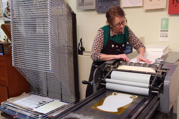
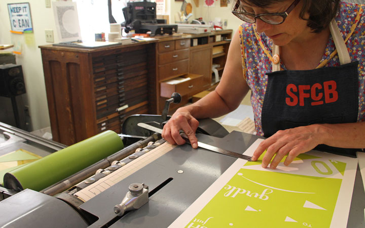
Printed on an antique Vandercook Universal One press, on archival, 100% rag (cotton) paper. Each piece is numbered and signed by both artists.
Colophon reads:
Fatima Al-Fihri (c. 800 – 880) grew up in Fez, Morocco with her sister Miriam, daughters of a wealthy Tunisian merchant. The daughters were well-educated and devoted to their community. After the death of their father, Fatima vowed to spend all her inheritance in building a mosque, both a place for worship and a center of learning. In 859, she founded Al-Qarawiyyin, which offered courses in grammar, rhetoric, logic, medicine, mathematics, astronomy, chemistry, history, geography and music — drawing scholars and students from all over the world. (Gerbert of Auverge — later Pope Sylvester II — studied there, and was credited with the introduction of Arabic numbers and the concept of zero to Europe.) This important spiritual and educational center of the Islamic world, one of the largest mosques in Africa, is considered the oldest university still in operation. As a woman with such generosity and vision, Fatima is remembered and honored as Oum al Banine, “the mother of the children.”
Illustrated by Chandler O’Leary and printed by Jessica Spring, with the knowledge that all women must have the right to an education.
UPDATE: poster is sold out. Reproduction postcards available in the shop!
*** The edition size needs a little explanation—every broadside has a symbolic edition number, but this piece is extra special. This number is the solution to an equation we devised out of numbers that are highly symbolic in Islam. Arabic culture is credited with the invention of algebra—a term derived from an Arabic word meaning “the reunion of broken parts.” We arrived at our edition number by multiplying 66 (the number that represents Allah in Islamic numerology) by 19 (considered by some mystics to be the “Key to the Q’uran”), and then dividing the result by 10 (ten-pointed stars are common elements in Arabesque patterning, as well as our broadside design). The “.4” in our edition number represents four artist proofs that exist outside the numbered edition, and set aside as gifts for four important women in our lives. These four women mirror the four “Women of the First Rank in Islam” (Khadijah, first wife of the Prophet; Fatimah, the fourth daughter of Khadijah and the Prophet, and the wife of the Fourth Caliph; the Virgin Mary; and Asiya, wife of the pharaoh and stepmother to Moses).